Search impacts everything from the way we find a website (Google), to how we find content on a site. But search also puts a heavier burden on the user than most website interactions. Users must locate your search form, enter a meaningful keyword, and sift through pages of results in order to find the most relevant information.
In Part 1 of this two-part series, Rebecca Wyatt, Senior Consultant at EK, explains the best practices to make search forms as intuitive as they can possibly be for your users. In Part 2, we’ll follow up with UX design best practices for search results.
Make The Search Form Easy To Find
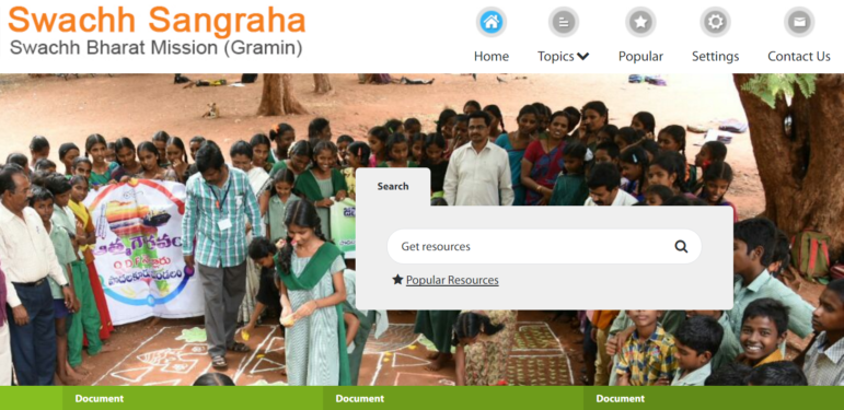
Most users will look for your search tools in the top right corner of the page. Keep your search bar in a predictable location or make it very obvious on the page. The example below is from a site EK built for an international client.

In addition to location, make sure the design of your search bar is highly visible on the page. Some designs hide the search bar, requiring users to click on the search icon to expose the form. This makes it harder for users to identify search tools and also requires more clicks before users can find what they’re looking for. The argument for this is that it presents a cleaner design, but the trade-off is not worth it.

Tell Users What To Type
There are lots of prompts you can add to your search bar. You can ask a question such as “Where would you like to go?” or a command such as “Find Recipes.” In this example, “Discover Connections” is a meaningful prompt to help users find professional connections by area of expertise.

Use Auto-Complete
As users are typing in keyword searches, you can reduce their keystrokes by enabling auto-complete. In addition to reducing keystrokes, it may also improve search results by suggesting accurate terms. A common example of this feature is when searching for flights. Users can begin typing a city and are prompted with a list of potential airports as in this example from Google Flights.

Filtering Search Results
After users enter a keyword in your site’s search box, they’re served up a list of results sorted “by relevance.” The logic which determines relevance is hidden from your user, and often, the content at the top of the list is not perceived as the most relevant to users. This gap between perceived relevance and actual relevance results in frustrated paging through search results – or even abandoned searches. Allowing your users to filter their search results allows them some control over what is most relevant and allows them to find their content faster. It also gives you more data about what users are actually searching for on your site, and helps you more accurately return a relevant list to your users over time.
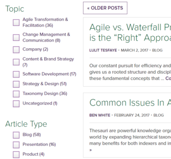
The most familiar option for users to filter search is a series of checkboxes in the left column. This allows users to see most (if not all) of their filtering options on the screen at the same time as they are viewing search results. In addition to allowing users to filter their search results, filter labels provide information to users – promoting user discovery of content which they may not have known existed. EK uses this type of filtering in our own knowledge base.

There are some situations in which horizontal filter bars may be preferable to the left column list of filters. Mobile first designs may benefit from this treatment. Filter bars should be used with caution, however as they do require additional clicks to expose information to users and are therefore more difficult to navigate. Another caution: In many implementations, users can only expose one category of filter at a time – which is limiting.
Summary
Completing the search form, filtering search results, and selecting the most relevant content are some of the most demanding tasks which you’ll ask of your users. Employing these User Experience best practices will lessen this burden, setting your users up for success. These best practices are never black and white solutions, however. Always analyze your users’ goals and design your search tools accordingly. EK offers a search design workshop which will produce a set of recommendations to optimize your site’s search. Please contact us for more information.
