In my nearly twenty years of taxonomy consulting, I’ve consistently preached the gospel of user experience design. I coined the term “Business Taxonomy” in order to reflect the basic principle that taxonomies for today’s information users need to reflect the natural language of those business users. In short, a good taxonomy shouldn’t require training for those who will be asked to leverage it.

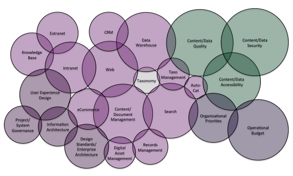
A complementary concept to the Business Taxonomy is the idea that a taxonomy is only as good as the interface that exposes it. That is why UX design is such a critical factor. Taxonomy design should never take place in a vacuum. In fact, a successful taxonomy design effort needs to consider a wide array of non-taxonomy factors. I created this purposefully chaotic graphic to demonstrate the wide array of technical, content, political, budgetary, and user design factors that taxonomy design impacts and that also have a major influence on the design, implementation, and governance of a taxonomy.
Amongst all of these factors, UX Design is one of the most important. Though “back-end” taxonomies still exist for purposes of management and regulatory compliance, the vast majority of today’s taxonomies are front-facing business taxonomies. As a result, the exposure of the taxonomy to the user and the means by which the user may interact with the taxonomy is nearly as important as the taxonomy design itself.
Though I’ve been working with clients to realize this goal for many years, I was pleased at this year’s Taxonomy Boot Camp and KMWorld to see the wider community opening up to the idea. Bram Wessel of Factor, in particular, offered some great reinforcement of this important union between taxonomy design and user-centered design.
With a well-designed Business Taxonomy as well as a user-centered design approach to enable that taxonomy, the overall findability of the information system will be maximized. I like to reference sites like Bluefly and Nike that have realized this synergy. Those are two great eCommerce examples, though I’ve worked with many clients to realize the same blend of form and function for internal systems that are serving up information content instead of shoes or slinky dresses.
It is no mistake that many of the taxonomy design best practices I offer align with UX design best practices. I consider the following as a few of the most important:
1) Taxonomies should use “clean” language, avoiding acronyms, jargon, and other internal language that needs to be learned.
2) Taxonomies should offer no more than 12-15 terms at any particular level. Beyond that, a user’s ability to quickly process it for purposes of tagging, search, or navigation plummets.
3) Taxonomies should be no more than 2-3 levels deep. Again, the ability to process a more complex taxonomy goes down markedly after this. More importantly, as business taxonomies are often translated to navigation, this honors the best practice that all pages should be reachable in three clicks or less. It is important to note that the use of faceted navigation may add additional clicks, but the basic best practice still holds as true.
Most importantly, business taxonomy should consider the needs and goals of the users as the primary design factor. Over the course of my taxonomy consulting with hundreds of organizations around the world, I’ve found this one principle to be the most critical and the surest indicator of a successful engagement with true user adoption and satisfaction. Enterprise Knowledge’s taxonomy design consulting can help your organization achieve those same results.
