
Visual Design to Enhance Your Message
On a daily basis, EK consultants create presentations for clients including everything from facilitation materials for knowledge management workshops and meetings, to educational web resources for web products. As a design enthusiast, I’m often asked by my colleagues, “Leah, can you help make this PowerPoint look pretty?” but you don’t have to be Monet to produce great aesthetics. Follow these simple design tips to create visually engaging content to enhance your message.
First, Content Before Design
Before you dive into design, you need a foundation — content! The key message you want to convey should dictate your design, not the other way around. Let design emphasize your message and support your greater content strategy. Similar to how content types act as a reusable template to produce consistent results, think of design elements the same way; as a template to create consistent, usable designs. Let’s not forget that the most important aspect when creating any business asset is your audience and their needs. You wouldn’t start building a house without the blueprints, so be sure to build your design from a content foundation.
To build your content foundation, think about what story you want to tell; then think about what images and visuals will help you tell it.
- Do you want your message to flow in a certain order?
- Are there words or messages you want to emphasize?
- Would your audience better understand your content if it was paired with a photo or repurposed as a visual?
Second, Apply Design Principles
Now that you have your content, let’s make it beautiful! When I’m creating any sort of asset, these are the design elements I always keep in mind to create clean, visually pleasing designs for my target audience.
Alignment
This seems like such a simple element, but the more I review others’ work, the more I realize alignment is often overlooked. To achieve top quality designs, it helps to picture your elements on a grid. Maybe you have text and an image you’d like to pair together – choose left, right, or center alignment. The key here is consistency.

Proximity
Proximity is the nearness between elements, which provides structure and organization to a layout. Related items should be placed close to one another, while unrelated items should be farther apart. A close proximity indicates a relationship and creates a visual unit; when elements are placed together, the eye perceives them as a group.
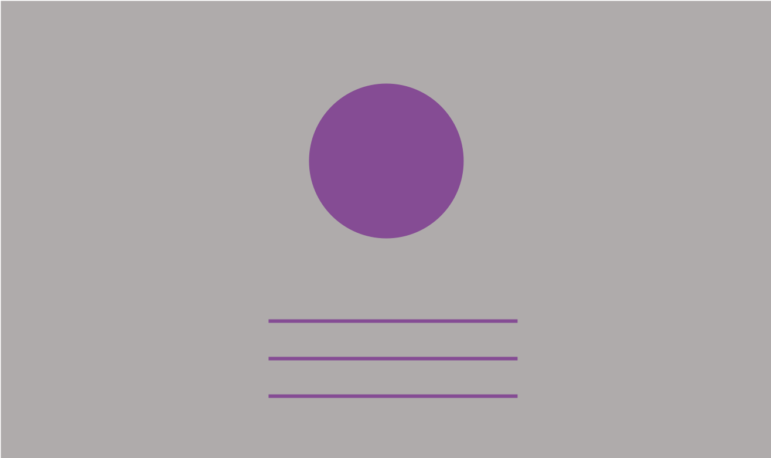
Balance
Think of your layout as a scale where each of your design elements has a weight. Whether it’s text, an image, color block, etc., consider its size and how much weight it has in relation to other elements in the layout.
To achieve the weight you’re looking for, there are three types of balance in graphic design to experiment with. When deciding which to use, you’ll want to think back to your messaging —what are you trying to achieve? What do you want to emphasize?
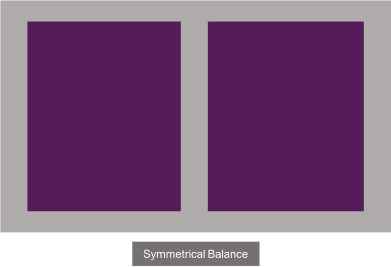
- Symmetrical balance is a mirror image balance. If you draw a line down the center, each side will have the same visual weight. This helps to achieve structure and organization.
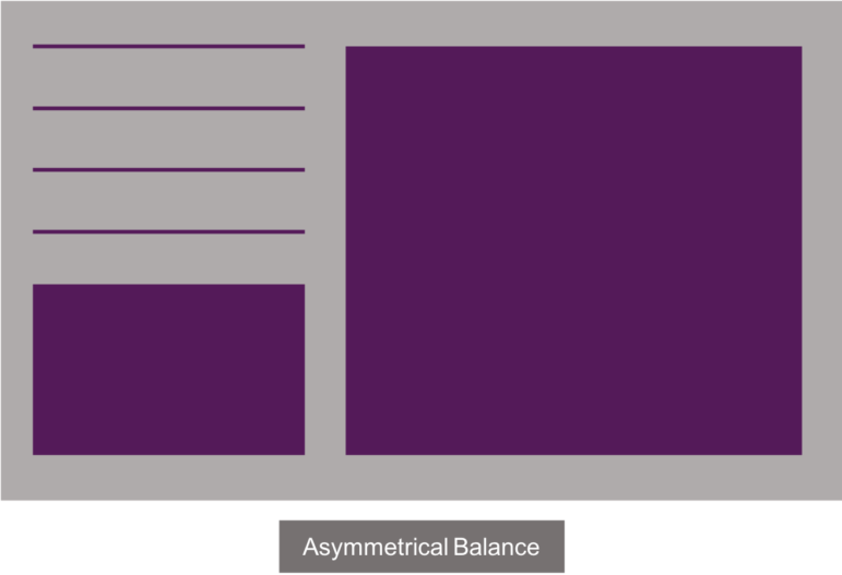
- In asymmetrical balance, both sides have a different weight, which produces a more casual look and feel. The dynamicness of the layout focuses an audience’s attention on the message.
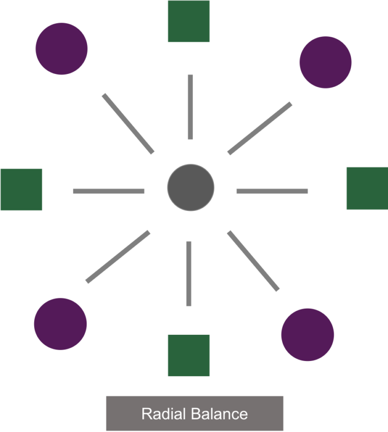
- With a radial balance, all elements radiate out from the center in a circular nature. All elements will guide the eye to the center of the layout.
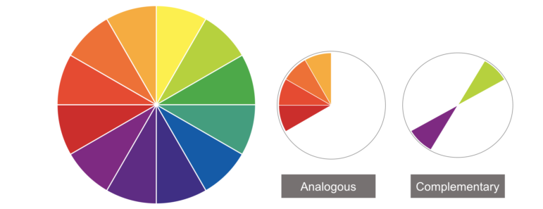
Color
Color improves contrast, assists in readability, and grabs the viewer’s eye. If you’re unsure what color palette to use, start with a neutral color or work within your organization’s established brand colors. If your organization doesn’t have brand colors to rely on, consider color theory and explore complementary or analogous colors.
Keep in mind, color evokes emotion — which can work for, or against you. When grounding your visuals in the key messages you’re trying to convey, be mindful of the emotions you’d like to elicit with that key message. Then, select colors that will help highlight those emotions. Also, don’t go overboard with your color scheme. Find a few colors that work well together and stick with that palette.
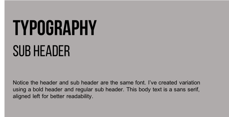
Typography
Just like your color choice, your font selection should also match the emotional tone of your message. Generally, serif is best for readability in print, while sans-serif is best for creating a legible web product. Here are a few basic rules of thumb:
- Avoid using too many fonts at once; 2-3 types is the general limit. A good trick is to use a variation of the same font to help achieve balance and variety — try bolding or italicizing your text.
- Text with a consistent purpose should have a consistent size. Headings or other content you want emphasized should be larger, but any body copy should be the same size throughout your layout.
- In larger bodies of text, left alignment makes content more readable.
Space
It can be tempting to fill up an entire page, but sometimes less is more. Space refers to the empty areas between components in the design. Empty space draws the eye to a point of focus and places more emphasis on the main item. Think back to your messaging. What should stand out? Create some space around it.
Empty space improves readability and creates a hierarchy. Think about how the elements are arranged and grouped in the design.
Summary
The most important thing to remember is that your message comes first; design comes second. Content and design should work together to strengthen communication. Once you’ve refined your key messages, basic design elements will help you create your own timely, professional, polished materials to help your audience understand and retain key messages.
Want to create visually appealing web content for your company’s website or intranet?
EK can help you identify your organization’s key messages and determine how to communicate them with relevant design — contact us to learn more.