Search results pages are lists of content which are relevant to the keyword search entered by your users. The concept is deceptively simple, but the design of your search results page plays a vital role in the overall experience users will have on your site.
As discussed in Part 1 of this two-part series, search puts a heavier burden on the user than most website interactions. Users must locate your search form, enter a meaningful keyword, and sift through pages of results in order to find the most relevant information. The look and feel of your search results page should make it as easy as possible for users to find the information for which they’re searching.
Should I Click on This?
The primary purpose of information in a list is to present users with enough information to decide if they want to read any more. Ask yourself, “What information do my users need to choose the right item in the list?” Make sure that information is included in the search results. No more. No less.
List v. Grid View
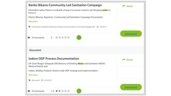
The most common page layouts for a search results page are a vertical list and a grid view. A list view is a good choice when the content is not highly visual (such as a list of documents) and when communicating the sort order clearly is a priority. Lists simply convey a sense a priority more clearly, with items at the top having a higher priority or relevance. This was the right solution for an international client for which EK recently designed a search results page.
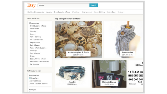
A grid view is often the best decision for e-commerce sites and other search results for which users would appreciate the ability to scan highly visible content. Etsy provides a great example of this visually appealing search results layout.
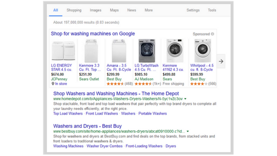
Even Google, from which users expect a vertical list, will sometimes present search results more visually if that view will be of benefit to users. This search results page uses a combination of the list and grid page layouts.
Is This What You Meant?
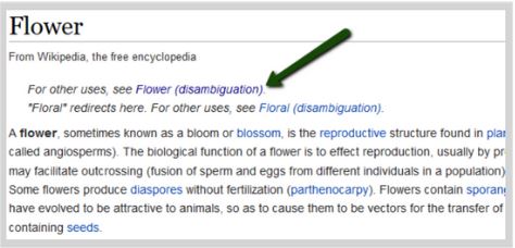
Users will often enter vague search terms which could mean multiple things. Prompting users to clarify ambiguous search terms can greatly improve their satisfaction with search results. Wikipedia does this well through its disambiguation pages. If a user enters a search term which may have multiple meanings, he or she is taken to the page of the most likely search result, but similar results are clearly displayed.
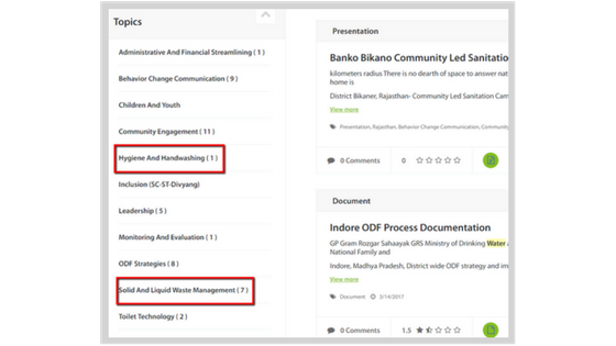
If you think about it, disambiguation is just a fancy way of faceting your search results. In this example, the faceted navigation would allow users who entered the ambiguous search term “water” to clarify: did you mean water for hand washing or water for solid waste management?
Make it Easy to Click the Selected Result
Once your user has entered the search term, filtered the list, and found the ideal result in the list, it’s really frustrating if they try to click on it and have trouble. At minimum, the title and an additional link should click through to the selected content when clicked. If you’re using a more visual grid layout, the entire square should click through to the selected content, including the image.
Summary
User-centered design principles are really important when it comes to a search results page. Just like a well-designed search results page, the first item in this list is the most important, so let’s review it again. “The primary purpose of information in a list is to present users with enough information to decide if they want to read any more.”
Do you need some help applying user-centered design and identifying the specific information your users need? Contact us at EK. We can help!
