
In my twenty-plus years of search consulting, I’ve seen the technology move from something that hopefully worked on a good day, to a generally acceptable experience that was common, but typical. For a long time, search was all about words; you’d enter keywords and get text links returned. Though serviceable, this experience is far from natural or intuitive to how we as humans think and want to interact with an enterprise search solution. We’re now in a period in which search is maturing from words to a more interactive experience – one in which the relevant information can be delivered without the searcher having to ask for it. Dashboards facilitate this transition from an experience that requires an initial action on behalf of the searcher to a more interactive one where more information can be gleaned directly from the search results screen, and more actions can be taken that will facilitate the user’s search goals.
For the longest time, Enterprise Search has looked and acted the same way. Most of us can relate to the experience:
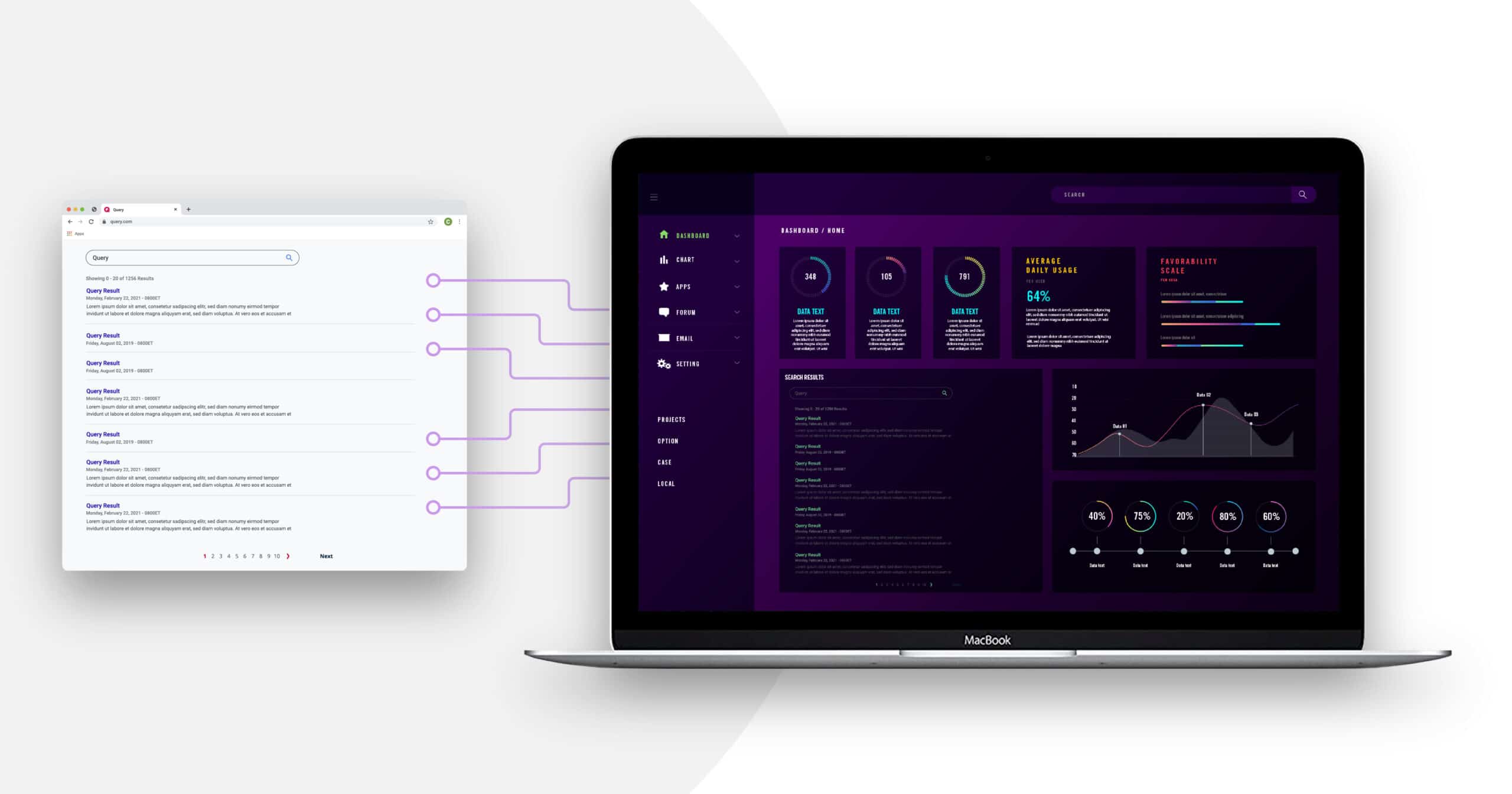
- Open a browser and navigate to your application.
- Enter some keywords in a Search Box.
- View a list of results rendered as blue links with perhaps a list of facets or filters running down the left-hand side of the results.
- Move back and forth between the results page and the actual results by clicking on a possible result and skimming the content.
In this instance, the search results are simply a list of links. Serviceable, sure, but not very intuitive, as in most cases they provide only a sliver of a hint about what the searcher will find once they click, and they seldom provide any actionable information without forcing the user to click at all. Truthfully, that is still an effective means of finding content and shouldn’t be entirely disregarded. There are still many times when your searcher will want the comfort of this experience. But that doesn’t mean it should or can be the only way to find content.
Introducing dashboards to an application’s Search UI provides three main benefits:
- Returning answers, not simply documents.
- Pushing information to a searcher instead of requiring them to pull it.
- Providing a more visually appealing experience that isn’t just easier to understand, but more pleasant as well.
Let’s take a look at each in more detail, looking at what it is and why it’s beneficial to an organization.
Returning Answers, Not Simply Documents
One thing that I have learned in my time advising clients in this area is that not every answer to a user’s search is a document. Effective search is about finding and returning answers in all their forms. We talk about this in terms of the complete spectrum of content, or the complete ecosystem of knowledge resources. Unlike traditional enterprise search, today’s searcher is not always looking for a document, she’s looking for information. Perhaps a document, but perhaps a mix of results that could include other media as well as experts from whom to connect, communities with which to interact, and learning resources to enhance one’s performance.
Dashboards allow the presentation of content in a variety of formats, not just textual. For example, if I’m a call center agent indexing all my customer inquiries, determining which of my stores received the most complaints is not contained in a single document. However, a chart showing all of my calls broken down by stores will provide that information immediately. Getting the right answers to my searchers at the right time makes them substantially more productive.
Pushing information
Incorporating dashboards provides relevant information to a searcher without them having to take any action. Gone are the days when a searcher has to spend time crafting the perfect query before seeing results on the page. Relevant content appears on the home page in the form of dashboard components as soon as a searcher visits the page. This provides value to an organization as an employee spends less time looking for information, and more time acting on the relevant content they have found.
Visually appealing
Instead of presenting a staid page of links, dashboards provide the ability to present an interactive, immersive experience to a searcher. Built on the structured data gleaned from your content, a searcher can click through geo-location-based maps, traverse in and out of charts and graphs, and explore hot topics via heat maps to surface the information that’s important to them. This benefits the organization by increasing adoption of the search platform. A more appealing experience naturally leads to greater use which produces informed, productive employees.
Now that we’ve seen the benefits of incorporating dashboards into your search UIs, look for an upcoming blog where I talk about how your organization can get there, and what the key pieces are that you need to have in place to leverage their capabilities.
In the meantime, contact us for any assistance with your search and content needs.