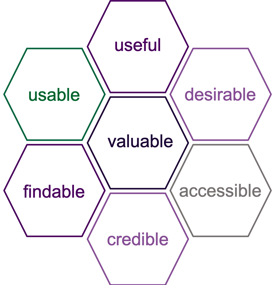
Because EK strives to develop the best web products for our clients, we have a lot of conversations about how to create the best experience for the users of those products and systems. Again and again we come back to the concept of Peter Moreville’s User Experience Honeycomb – a helpful tool for understanding the various facets of user experience.
Moreville’s User Experience Honeycomb advanced the conversation from just discussing usability and gave designers of web products a more complete tool for strategically analyzing and improving the overall experiencing of interacting with web products. With this increase in completeness came an increase in the complexity of the analysis and discussion. As we decide which facets of the UX honeycomb to prioritize in our product development, accessibility often gets a lower priority than the others (unless we’re developing products for the Federal government). Accessibility is ranked towards the bottom of the UX honeycomb at our peril, however. As discussed below, designing an accessible web product cannot be separated from the other aspects of user experience.
Accessible
IT Accessibility simply means that our web products and content must be accessible to anyone – regardless of disability. In an analysis of the intersection between accessibility and user experience it is important to acknowledge the obvious fact that accessibility is one Moreville’s facets of user experience. If someone is blind and requires the use of screen readers to access the content on our websites, their user experience is going to be poor if we haven’t built an accessible product. But the strategies we employ to ensure our web products and web content are accessible ultimately impact other aspects of user experience beyond the “accessible” facet of the honeycomb.
Findable
One of the core services of Enterprise Knowledge is knowledge management strategy and design, so creating findable content is near and dear to our hearts. One of the key ways we ensure content is findable (sometimes via keyword search, and sometimes via faceted navigation) is through metadata. 508 compliance requires key metadata be associated with any web content. At minimum, this should include:
- Title
- Author
- Subject
- Keyword(s)
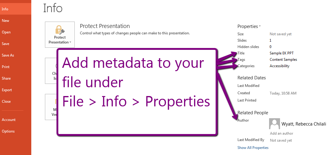
 If you’re creating content directly in a CMS, this will often be accomplished by “tagging” content (i.e. this blog post is tagged to topic/subject = “Content and Brand Strategy” on the EK website). If you’re creating a document like a PowerPoint presentation or a PDF that will be uploaded to a document management system, you can add the metadata under File > Info > Properties. Adding this information to your web content will simultaneously improve the findability and the accessibility.
Valuable
Take a moment and think about the product value statement for any product you’re developing. Is it:
- To improve employee performance through improved access to learning resources?
- To provide an enticing view of goods and services for sale and encourage consumers to purchase them?
- To raise awareness about the mission of a philanthropic organization?
I challenge you to think of any product value statement where accessible features and content would not enhance your ability to realize that value. According to the U.S. Census Bureau, nearly 1 in 5 people in the United States have a disability. This is not a small market segment – you can’t afford to leave them out.
Useful
As designers of web products we must always be confident and creative enough to challenge assumptions and ask whether the products we’re creating are actually of some use. Web products that are not accessible are inherently less useful. As professionals, we shouldn’t let managers or clients push us to design and build less useful products – it’s not in anyone’s best business interests.
Usable
Often when we talk about user experience, the conversation focuses on ease-of-use (usableness). While making our products more accessible can make human-computer interactions more complicated, a well-designed, accessible system can understand enough about the user to personalize the experience and offer the least-restrictive option to meet that user’s accessibility needs. Barring the level of complexity (or budget) for an automatically personalized user experience, we can allow users to self-select the level of accessibility and assistance that is required. For example, not everyone needs an audio-described version of a video or a companion video transcript, but offering an option to our users can only improve the usability of our products
Desirable
The principles of emotional design (focusing on how a user feels when interacting with a product) can help us use improved accessibility to design desirable web products. Research tells us that we can affect the desirableness of a product through three key strategies:
- Visceral emotional design – Here we design for aesthetic pleasure. When we factor in aspects of accessible product design like adequate contrast ratio, we are improving the visceral emotional design of the product.
- Behavioral emotional design – Here we focus on how well the product performs the desired functions. There’s a lot of overlap between behavioral emotional design and designing a usable product (discussed above).
- Reflective emotional design – In reflective emotional design, we help our product’s users understand the product’s impact on their lives – even when they’re not actively using it. To design for this we really have to understand our users and think about how we want them to feel when they use the product. It’s the most complex of the three tiers of emotional design, but again – improving accessibility, while not compromising style and simplicity, can only improve the emotions users associated with our products.
Credible
Stanford’s Web Credibility Research has resulted in this top 10 list to boost your website’s credibility. It seems pretty credible – supporting research and all. While accessibility is not directly mentioned, a site that is easy to use – and useful (number 7 on the list) repeats two elements of the user experience honeycomb discussed above. In short, good design is good design and a well-designed product improves accessibility, credibility, and overall user experience.
Summary
When designing web products – and creating the content which fills those products – it’s easy to think that the technical experts and leadership within an organization know what’s best. It’s important, however, to prioritize the needs of the system’s users, even if those needs contradict what we think we know. The tension between leadership’s desires and users’ needs already lends a layer of complexity to product design and content creation, and it’s easy for accessibility concerns to get squeezed out by that tension. EK’s consultants can help you balance the tension of these conflicting needs when designing your product and crafting content. Contact us to learn more.

